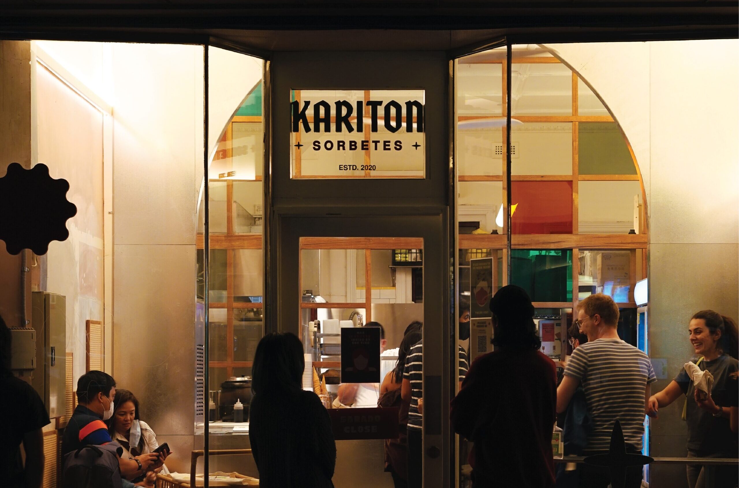
Kariton Brand Identity & Flagship Store Design
Kariton
2020
Footscray, Melbourne
Brand Identity, Creative Direction, Visual Design, Retail Design
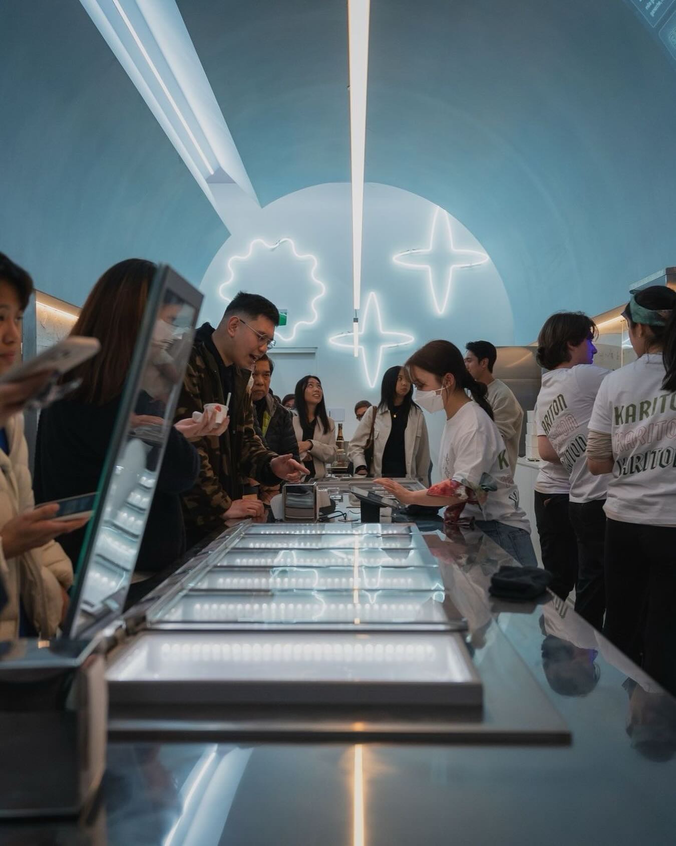
Kariton Sorbetes started as a Filipino-inspired gelato shop in Footscray. I worked with the owner, John Rivera, on the brand identity and signage for the flagship store.
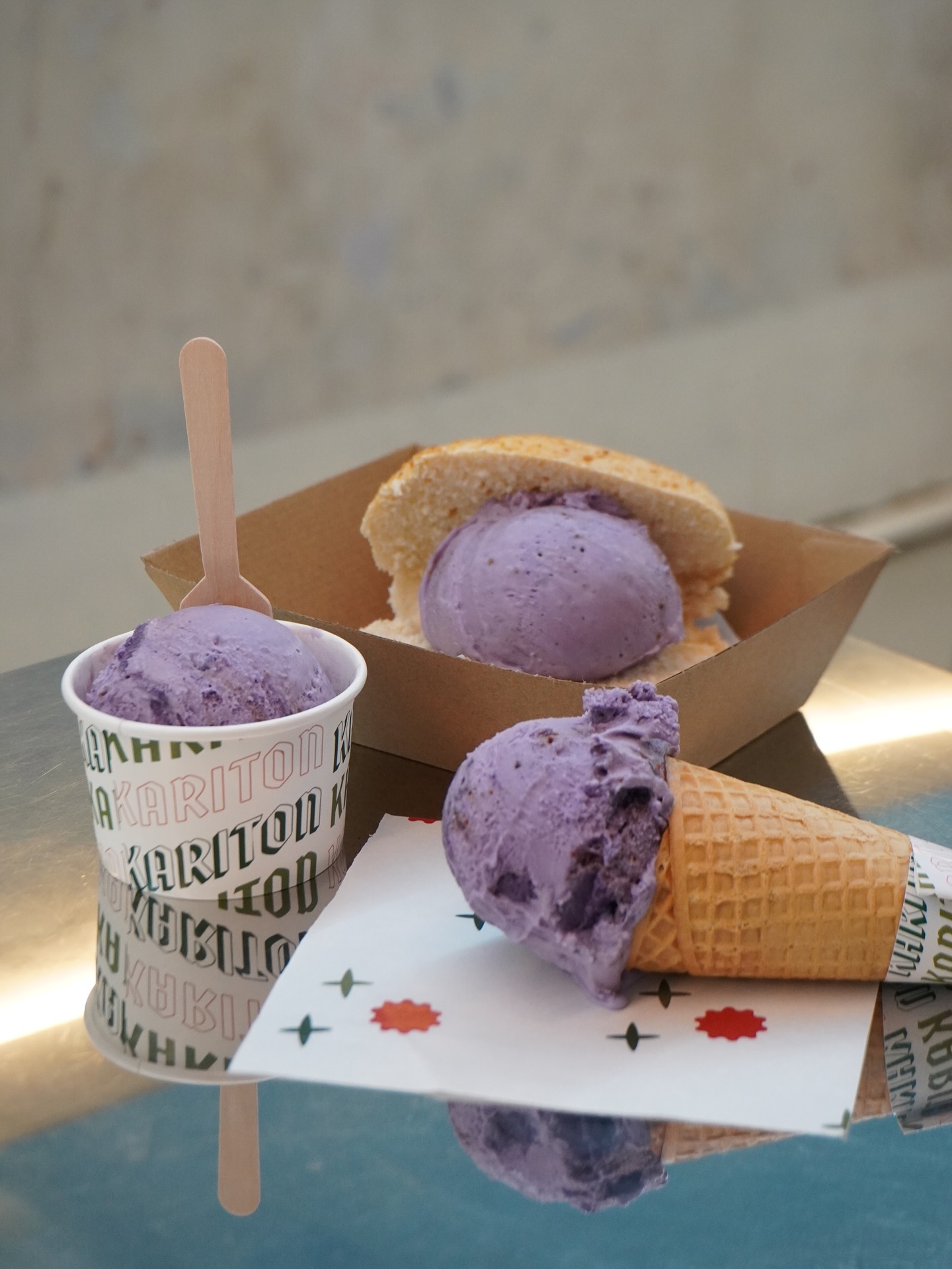
The name gave me the concept. A kariton is the cart that sorbetes vendors push through the streets in the Philippines. I borrowed the bright colours, hand-painted lettering, and wheel-and-star graphics from those carts, and gave them a cleaner, modern structure that suits Melbourne.
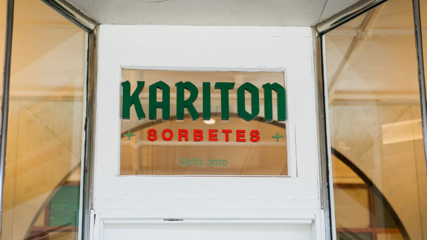
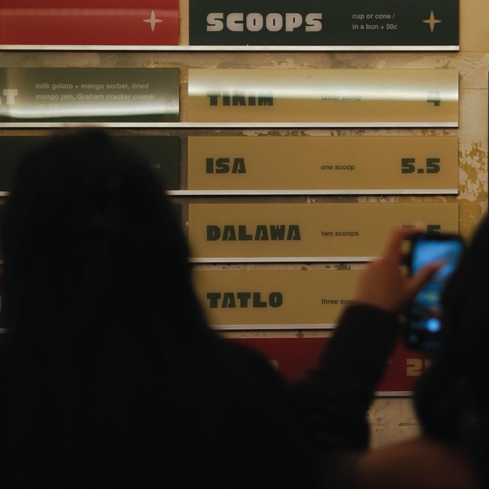
Choosing the colours and the main graphics was the most important decision I made on the project. I designed the menu board layout myself. It uses colour and Tagalog to set the tone, and the team can swap flavours in and out as needed. The rest of the identity works the same way: it’s a flexible system that other designers can build on and keep consistent.
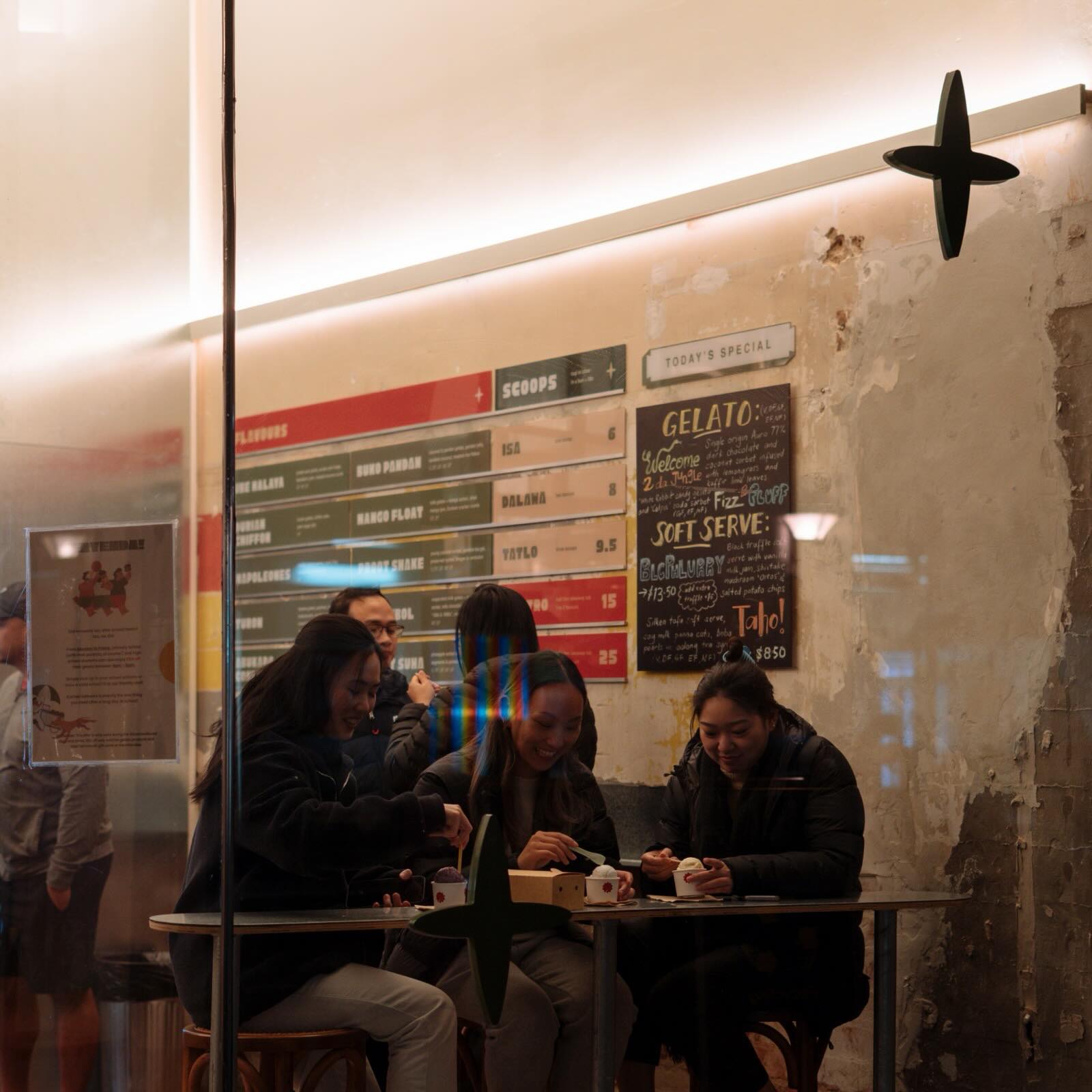
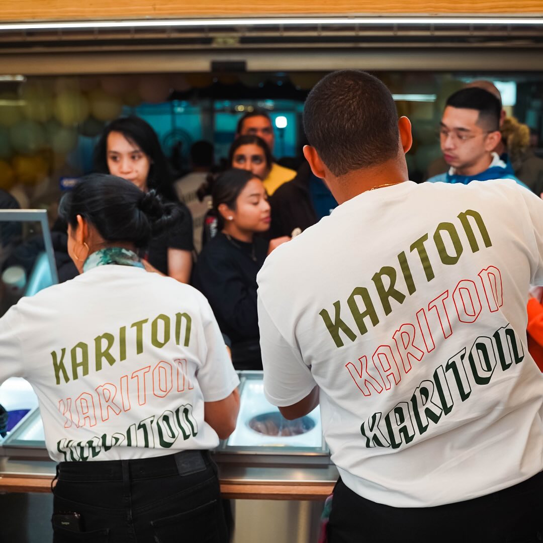
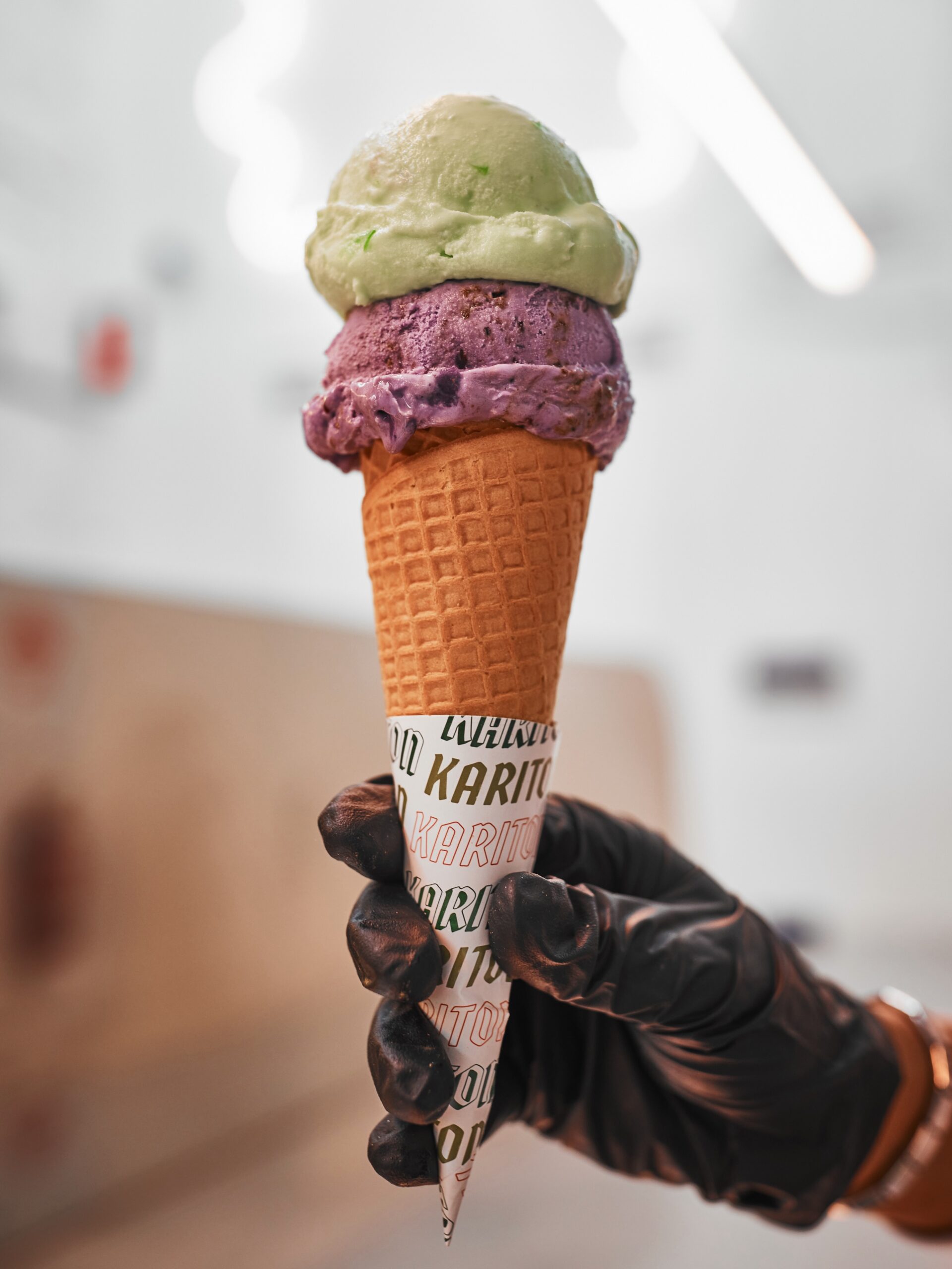
Six years on, the brand goes by Kariton and sells gelato, sorbet and desserts across Footscray and Sydney and has expanded into the Philippines. The shops have changed, but the core elements I designed are still there, now on the packaging and merchandise too.
What stayed with me most was designing for my own community and watching Filipino families recognise the Kariton in the branding here in Australia. As a Filipino designer in Australia, seeing some of that work in the Philippines means a great deal to me. Photography by Kariton